Frontend Overview
This guide explains the structure of the Sokrates Platform frontend and where to find the relevant code to make changes to the UI.
Table of Contents
Technology Stack
The Sokrates Platform frontend is built with:
- Framework: Next.js (React)
- UI Library: shadcn/ui (opens in a new tab) - Modern, accessible component library
- Styling: Tailwind CSS
- Type Safety: TypeScript
All UI components follow the Sokrates Platform design system available on the Figma board. New components should always use shadcn/ui as a base to maintain design consistency.
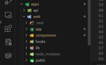
Folder Structure
The two most important folders for frontend development are:
apps/web/app: Contains the main application code, including pages, layouts, and global stylesapps/web/components: Contains reusable UI components (buttons, modals, forms, etc.) and specific subpage components
Frontend Architecture
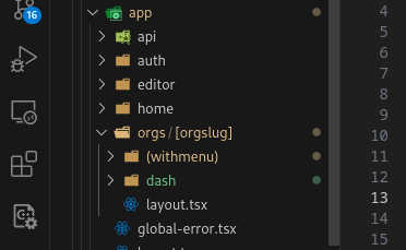
Inside the apps/web/app/orgs folder, you'll find two relevant folders:
withmenu: Contains the general Dashboard (Courses page) and the Course Introduction pagedash: Contains all other main pages (Users, Settings, Exercise Library, Course Editor, etc.)
Pages in withmenu folder
Courses
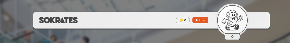
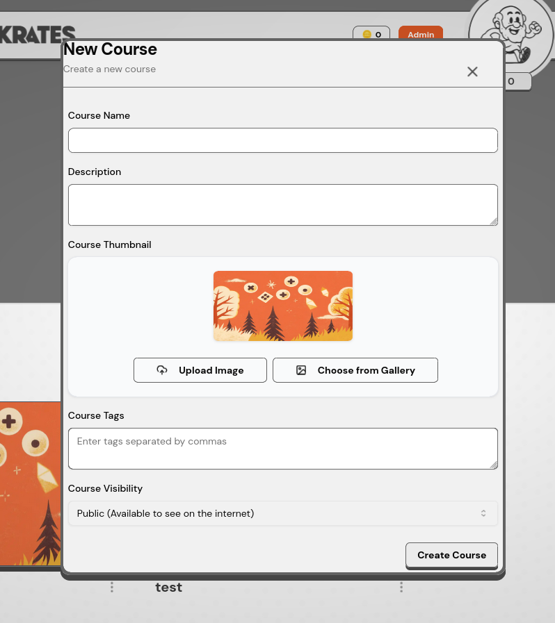
Formerly known as the Dashboard, the Courses page is the anchor point of the Sokrates Platform. Here users can see all the courses they are enrolled in. Admins can also create new courses from this page.
/dashboardwmenu.png)
📂 Where to find
/dashboardwmenu2.png)
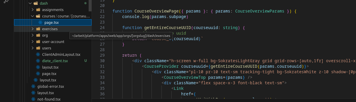
Course Introduction Page
This page serves as the introduction/overview page for a course. Users can see course details and enroll in the course if they are not already enrolled.
/courseintro2.png)
📂 Where to find
/courseintro.png)
Pages in dash folder
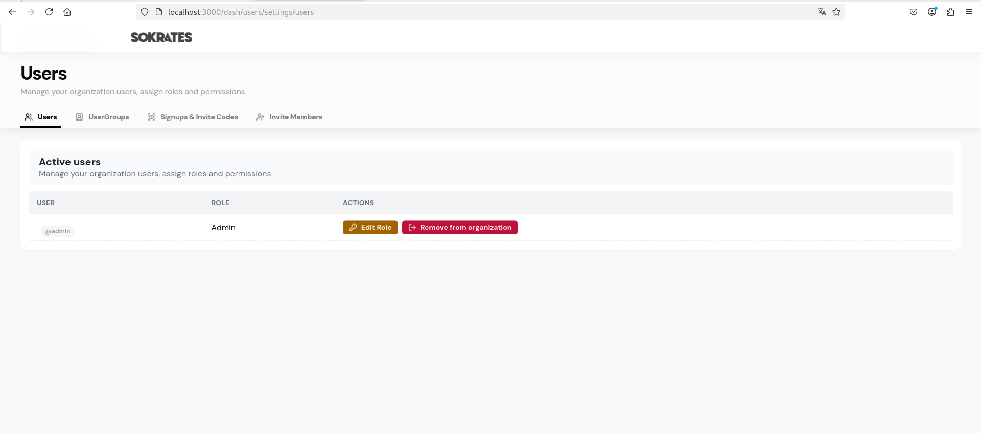
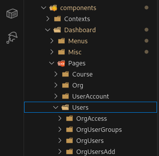
Users
This page allows Admins to manage users within the organization. Admins can view user details, assign roles, and manage user access to courses.
📂 Where to find
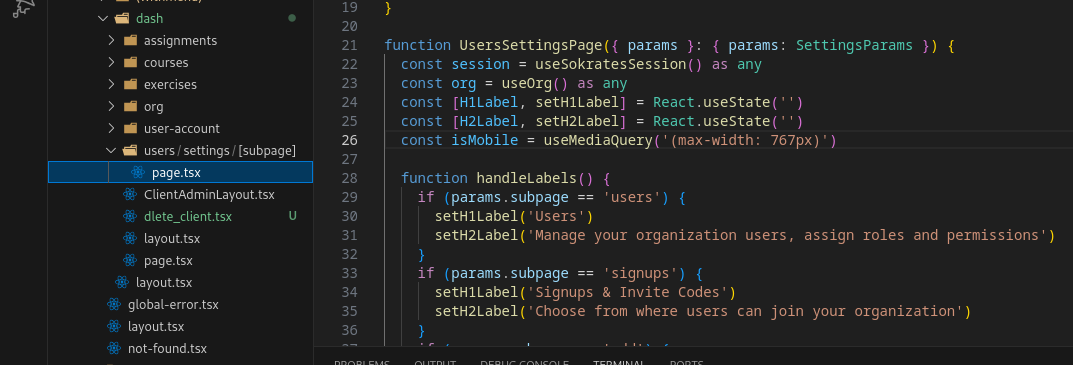
The Users page is separated into 4 subpages (visible in the tabs above).
📂 Where to find the subpages
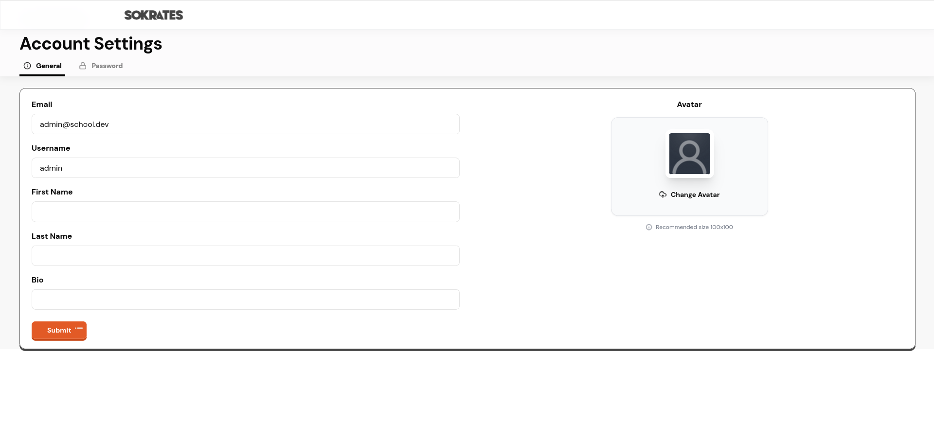
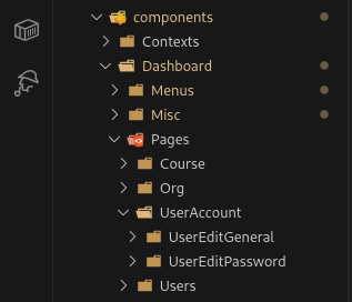
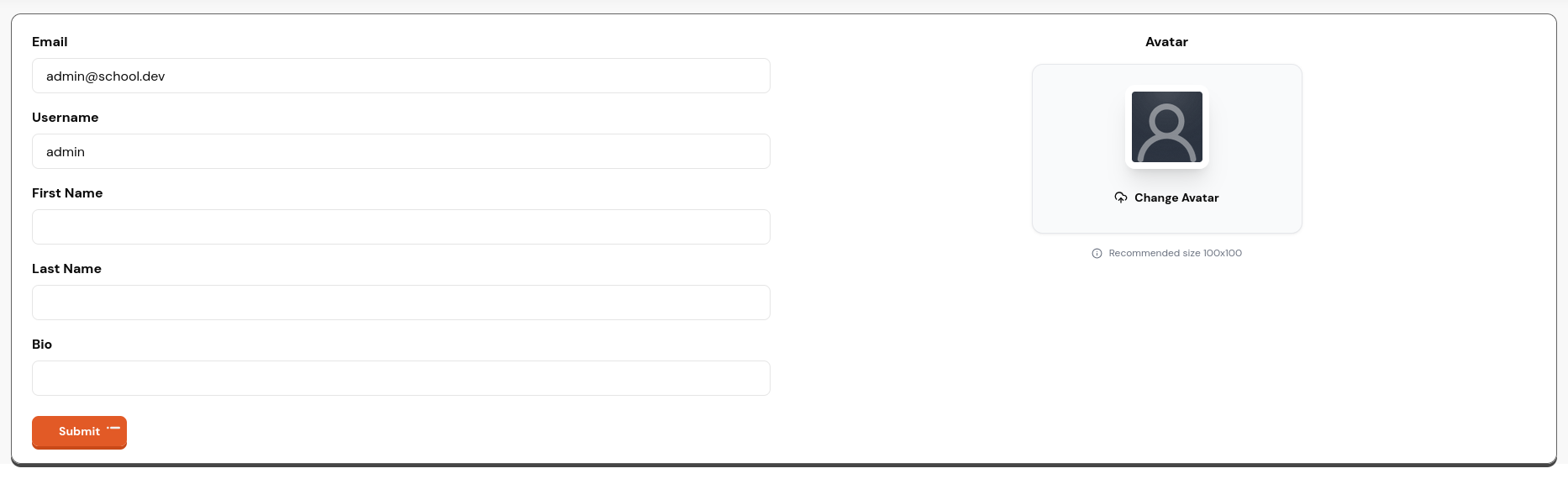
User Account Settings
This page allows users to manage their account settings, including updating personal information, changing passwords, and updating their profile picture.
📂 Where to find
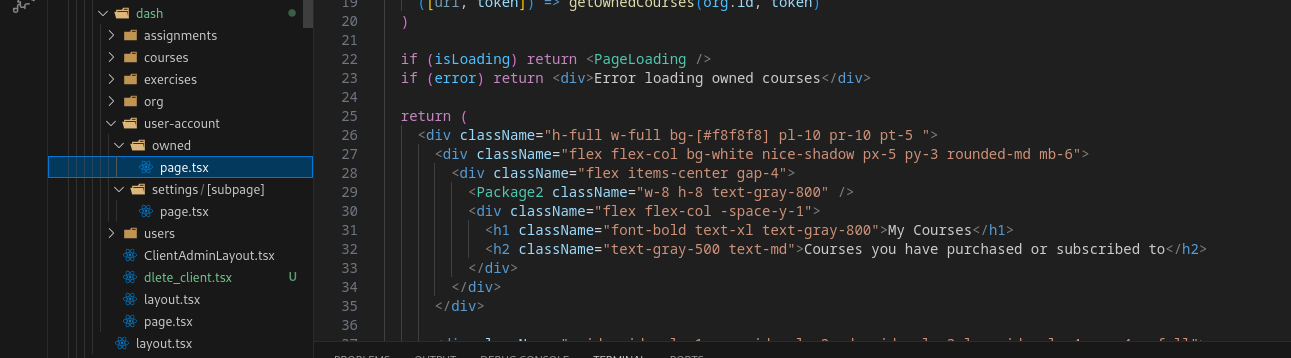
The User Account Settings page is separated into 2 subpages: General Settings and Password Settings.
📂 Where to find the subpages
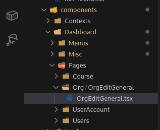
Organization General Settings
This page allows Admins to manage general organization settings, including updating organization information, branding, and preferences.

📂 Where to find

The Organization General Settings page content is mostly contained in one subpage.
📂 Where to find the subpage
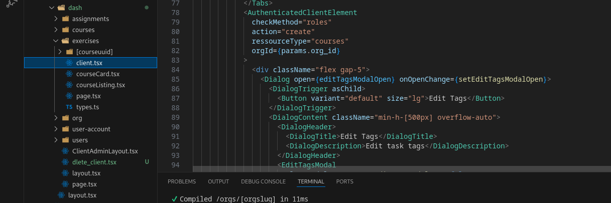
Exercise Library
This page allows Admins to manage the exercise library, including adding, editing, and deleting exercises. Users can also browse and search for exercises to include in their courses.
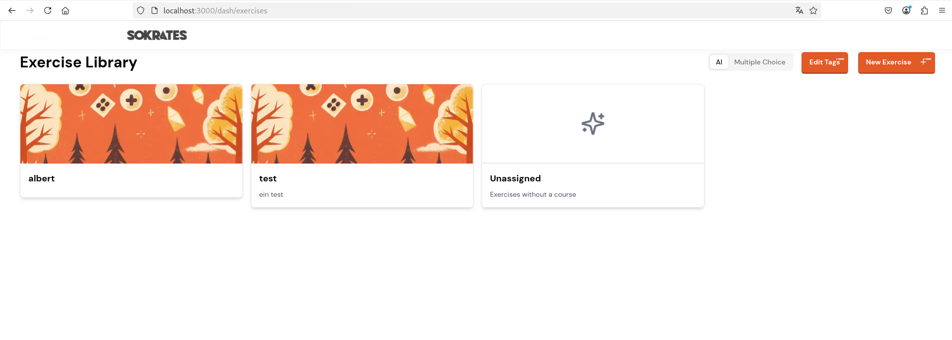
📂 Where to find
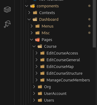
Course Edit Page
This page allows Admins and Instructors to create and edit courses. Features include:
- Adding and editing course details
- Managing course content (exercises, materials)
- Creating and editing the course map
- Configuring course settings
- Viewing enrolled members
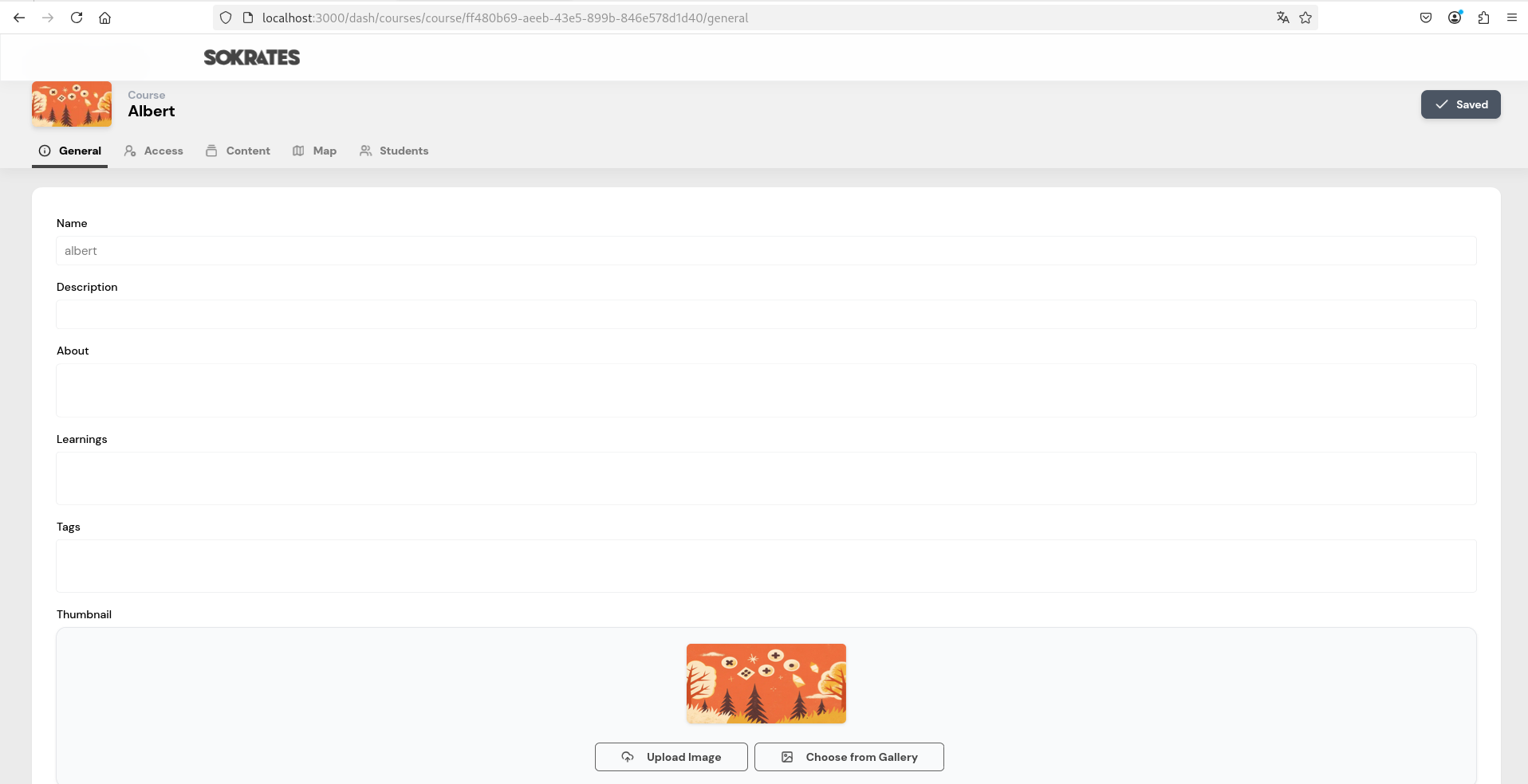
📂 Where to find
The Course Edit Page is separated into 5 subpages (visible in the tabs above).
📂 Where to find the subpages
Components
The reusable components used throughout the Sokrates Platform can be found in the apps/web/components folder.
UI Components
This folder contains all reusable UI components from the shadcn/ui library. All components are styled according to the Sokrates Platform design system (available on Figma).
Design Standard: New components should always be implemented using the uniformly designed shadcn/ui components as a base to maintain consistency across the platform.
Component Examples
Buttons

Badges

Cards
📂 Where to find UI components
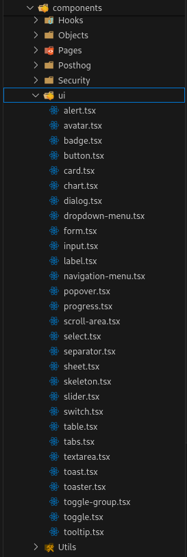
Common UI components include:
- Buttons (primary, secondary, outline, ghost, etc.)
- Modals and dialogs
- Forms and input fields
- Cards and containers
- Navigation elements
- Badges and labels
- Tooltips and popovers
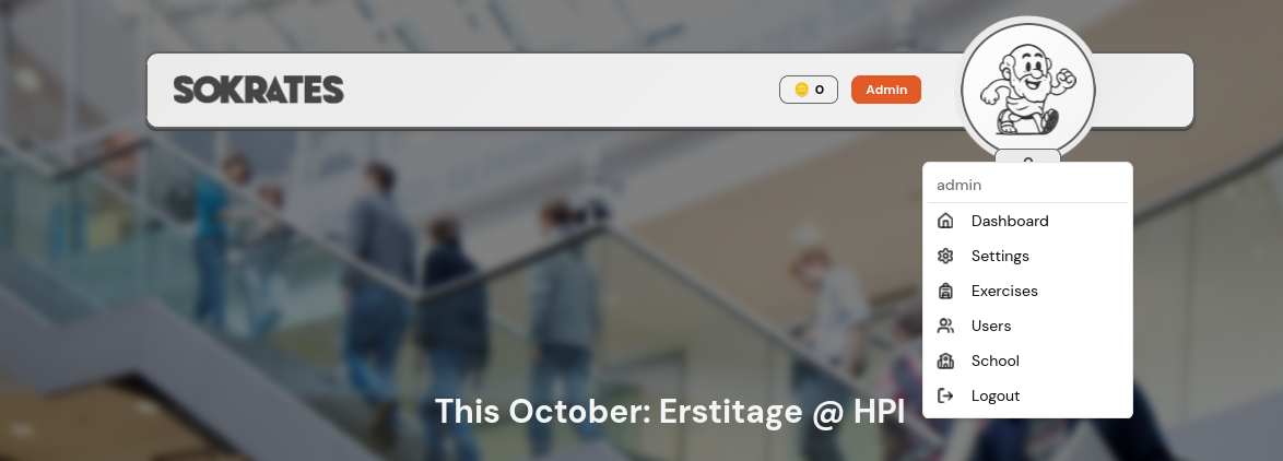
Menu Bar
The Menu Bar component is a crucial part of the Sokrates Platform's user interface, providing easy navigation across different sections of the application. It is designed to be responsive and user-friendly, ensuring users can quickly access the features they need.
For easy access, the Menu Bar navigation can be expanded and collapsed by clicking on the profile picture.
📂 Where to find

Modals
Modals are used throughout the Sokrates Platform to display important information, confirm actions, or gather user input without navigating away from the current page.
Essentially, every time a popup appears on the screen, it is most likely a modal component.
📂 Where to find
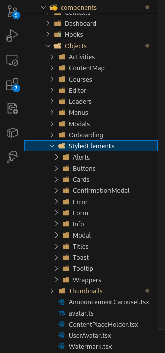
Styled Elements (Legacy)
⚠️ Deprecated: Styled Elements are legacy UI components from the original LearnHouse platform and should not be implemented in new features. Some parts of the Sokrates Platform still use these elements because there hasn't been a suitable way to replace them with shadcn/ui components yet.
Example: Course Card
One example of a styled element is the Course Card used on the Dashboard page. This should be migrated to the new shadcn/ui design system when possible.
📂 Where to find
Development Guidelines
Best Practices
- Use shadcn/ui components: Always start with shadcn/ui components as your base
- Follow the design system: Refer to the Figma board for design specifications
- Component reusability: Create reusable components in
apps/web/components - Naming conventions: Use descriptive, PascalCase names for component files
- TypeScript: Always use TypeScript for type safety
- Avoid legacy components: Do not use Styled Elements for new features
File Organization
apps/web/
├── app/
│   └── orgs/
│       ├── withmenu/     # Dashboard & Course Intro
│       └── dash/         # All other pages
└── components/
    ├── ui/               # shadcn/ui components
    ├── modals/           # Modal components
    └── [feature]/        # Feature-specific components
Adding a New Component
- If it's a shadcn/ui component, install it using the CLI:
npx shadcn-ui@latest add [component-name] - For custom components, create them in
apps/web/components - Ensure the component follows the design system
- Make components reusable and properly typed with TypeScript
- Document complex components with JSDoc comments
Need Help? If you encounter issues or need clarification on any frontend implementation, consult the Figma design board or reach out to the development team.